EnumType Field
EnumType Field
A multi-purpose field used to allow the user to "choose" one or more options defined in a PHP enumeration. It extends the ChoiceType field and defines the same options.
| Rendered as | can be various tags (see below) |
| Default invalid message | The selected choice is invalid. |
| Legacy invalid message | The value {{ value }} is not valid. |
| Parent type | ChoiceType |
| Class | EnumType |
Tip
The full list of options defined and inherited by this form type is available running this command in your app:
1
2
# replace 'FooType' by the class name of your form type
$ php bin/console debug:form FooType
Example Usage
Before using this field, you'll need to have some PHP enumeration (or "enum" for short) defined somewhere in your application. This enum has to be of type "backed enum", where each keyword defines a scalar value such as a string:
1
2
3
4
5
6
7
8
9
// src/Config/TextAlign.php
namespace App\Config;

enum TextAlign: string
{
    case Left = 'Left aligned';
    case Center = 'Center aligned';
    case Right = 'Right aligned';
}
Instead of using the values of the enumeration in a choices option, the
EnumType only requires to define the class option pointing to the enum:
1
2
3
4
5
use App\Config\TextAlign;
use Symfony\Component\Form\Extension\Core\Type\EnumType;
// ...

$builder->add('alignment', EnumType::class, ['class' => TextAlign::class]);
This will display a <select> tag with the three possible values defined in
the TextAlign enum. Use the expanded and multiple options to display
these values as <input type="checkbox"> or <input type="radio">.
The label displayed in the <option> elements of the <select> is the enum
name. PHP defines some strict rules for these names (e.g. they can't contain
dots or spaces). If you need more flexibility for these labels, use the
choice_label option and define a function that returns the custom label:
1
2
3
4
5
6
7
8
->add('textAlign', EnumType::class, [
    'class' => TextAlign::class,
    'choice_label' => fn ($choice) => match ($choice) {
        TextAlign::Left => 'text_align.left.label',
        TextAlign::Center => 'text_align.center.label',
        TextAlign::Right  => 'text_align.right.label',
    },
]);
Field Options
class
type: string default: (it has no default)
The fully-qualified class name (FQCN) of the PHP enum used to get the values displayed by this form field.
Inherited Options
These options inherit from the ChoiceType:
error_bubbling
тип: boolean по умолчанию: false, кроме случаев, когда форма compound
Если true, то любые ошибки в этом поле будут переданы родительскому
полю или форме. Например, если установлена, как true в нормальном
поле, то любые ошибки для этого поля будут присоединены к главной форме,
а не к конкретному полю.
error_mapping
тип: array по умолчанию: array()
Эта опция позволяет вам изменять цель ошибки валидации.
Представьте, что у вас есть пользовательский метод под именем matchingCityAndZipCode(),
который валидирует, совпадает ли город и почтовый индекс. К сожалению, поля
"matchingCityAndZipCode" в вашей форме нет, поэтому всё, что Symfony может сделать -
это отобразить ошибку наверху формы.
С настроенным отображением ошибок вы можете сделать лучше: привяжите ошибку к полю города, чтобы она отображалась над ним:
1
2
3
4
5
6
7
8
public function configureOptions(OptionsResolver $resolver)
{
    $resolver->setDefaults(array(
        'error_mapping' => array(
            'matchingCityAndZipCode' => 'city',
        ),
    ));
}
Вот правила для лево- и правостороннего отображения:
- Левая сторона содержит пути свойств;
- Если наружение генерируется в свойств или методе класс, то его путь - это
просто
propertyName; - Вы можете создать вложенные пути свойств, соединив их, разделяя свойства точками.
Например:
addresses[work].matchingCityAndZipCode; - Правая сторона содержит просто имена полей в форме.
По умолчанию, ошибки любого свойства, которое не отображенно, соберутся в
родительской форме. Вы можете использовать точку (.) в левой части, чтобы
привязать ошибки всех неотображённых свойств к конкретному полю. Например,
чтобы привязать эти ошибки к полю city, используйте:
1
2
3
4
5
$resolver->setDefaults(array(
    'error_mapping' => array(
        '.' => 'city',
    ),
));
expanded
type: boolean default: false
If set to true, radio buttons or checkboxes will be rendered (depending
on the multiple value). If false, a select element will be rendered.
group_by
type: string or callable or PropertyPath default: null
You can group the <option> elements of a <select> into <optgroup>
by passing a multi-dimensional array to choices. See the
Grouping Options section about that.
The group_by option is an alternative way to group choices, which gives you
a bit more flexibility.
Let's add a few cases to our TextAlign enumeration:
1
2
3
4
5
6
7
8
9
10
11
12
13
// src/Config/TextAlign.php
namespace App\Config;

enum TextAlign: string
{
    case UpperLeft = 'Upper Left aligned';
    case LowerLeft = 'Lower Left aligned';

    case Center = 'Center aligned';

    case UpperRight = 'Upper Right aligned';
    case LowerRight = 'Lower Right aligned';
}
We can now group choices by the enum case value:
1
2
3
4
5
6
7
8
9
10
11
12
13
14
15
16
17
18
use App\Config\TextAlign;
use Symfony\Component\Form\Extension\Core\Type\EnumType;
// ...

$builder->add('alignment', EnumType::class, [
    'class' => TextAlign::class,
    'group_by' => function(TextAlign $choice, int $key, string $value): ?string {
        if (str_starts_with($value, 'Upper')) {
            return 'Upper';
        }

        if (str_starts_with($value, 'Lower')) {
            return 'Lower';
        }

        return 'Other';
    }
]);
This callback will group choices in 3 categories: Upper, Lower and Other.
If you return null, the option won't be grouped.
multiple
тип: boolean по умолчанию: false
Если "true", то пользователь сможет выбирать несколько опций (а не только
одну). В зависимости от значения опции expanded, это будет отображаться
либо как тег выбора, либо как чекбоксы если "true" и тег выбора, либо селективные
кнопки, если "false". Возвращённое значение будет массивом.
placeholder
тип: string или boolean
Эта опция определяет, появится ли специальная опция "empty" (например,
"Выберите опцию" сверху виджета выбора. Эта опция применяется только
если опция multiple установлена, как "false".
Добавить пустое значение с текстом "Выберите опцию" в качестве текста:
1
2
3
4
5
6
use Symfony\Component\Form\Extension\Core\Type\ChoiceType;
// ...

$builder->add('states', ChoiceType::class, array(
    'placeholder' => 'Choose an option',
));
Гарантировать, что не отображается ни одна "пустая" опция значения:
1
2
3
4
5
6
use Symfony\Component\Form\Extension\Core\Type\ChoiceType;
// ...

$builder->add('states', ChoiceType::class, array(
    'placeholder' => false,
));
Если вы оставите опцию placeholder неустановленной, то пустая (без текста)
опция, будет автоматически добавлена только, если опция required установлена,
как "false":
1
2
3
4
5
6
7
use Symfony\Component\Form\Extension\Core\Type\ChoiceType;
// ...

// будет добавлена пустая (без текста) опция
$builder->add('states', ChoiceType::class, array(
    'required' => false,
));
preferred_choices
type: array, callable, string or PropertyPath default: []
This option allows you to display certain choices at the top of your list with a visual separator between them and the complete list of options. If you have a form of languages, you can list the most popular on top, like Bork and Pirate:
1
2
3
4
5
6
7
8
9
10
11
12
use Symfony\Component\Form\Extension\Core\Type\ChoiceType;
// ...

$builder->add('language', ChoiceType::class, [
    'choices' => [
        'English' => 'en',
        'Spanish' => 'es',
        'Bork' => 'muppets',
        'Pirate' => 'arr',
    ],
    'preferred_choices' => ['muppets', 'arr'],
]);
This options can also be a callback function to give you more flexibility. This might be especially useful if your values are objects:
1
2
3
4
5
6
7
8
9
10
11
12
13
14
15
use Symfony\Component\Form\Extension\Core\Type\ChoiceType;
// ...

$builder->add('publishAt', ChoiceType::class, [
    'choices' => [
        'now' => new \DateTime('now'),
        'tomorrow' => new \DateTime('+1 day'),
        '1 week' => new \DateTime('+1 week'),
        '1 month' => new \DateTime('+1 month'),
    ],
    'preferred_choices' => function ($choice, $key, $value) {
        // prefer options within 3 days
        return $choice <= new \DateTime('+3 days');
    },
]);
This will "prefer" the "now" and "tomorrow" choices only:
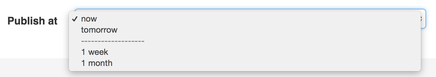
Finally, if your values are objects, you can also specify a property path string on the object that will return true or false.
The preferred choices are only meaningful when rendering a select element
(i.e. expanded false). The preferred choices and normal choices are separated
visually by a set of dotted lines (i.e. -------------------). This can be customized
when rendering the field:
- Twig
- PHP
1
{{ form_widget(form.publishAt, { 'separator': '=====' }) }}Tip
When defining a custom type, you should use the ChoiceList class helper:
1 2 3 4 5 6
use Symfony\Component\Form\ChoiceList\ChoiceList;
// ...
$builder->add('choices', ChoiceType::class, [
'preferred_choices' => ChoiceList::preferred($this, 'taggedAsFavorite'),
]);See the "choice_loader" option documentation .
trim
type: boolean default: false
Trimming is disabled by default because the selected value or values must match the given choice values exactly (and they could contain whitespaces).
These options inherit from the FormType:
attr
тип: array по умолчанию: array()
Если вы хотите добавить дополнительные атрибуты к HTML представлению поля, то
вы можете использовать опцию attr. Это ассоциативный массив с HTML-атрибутами
в качестве ключей. Этоможет быть полезно, когда вам нужно установить для некоторого
виджета пользовательский класс:
1 2 3
$builder->add('body', TextareaType::class, array(
'attr' => array('class' => 'tinymce'),
));data
тип: mixed по умолчанию : По умолчанию является полем основоположной структуры.
Когда вы создаёте форму, каждое поле изначально отображает значение соотствующего свойства данных домена формы (например, если вы привязываете объект к форме). Если вы хотите переопределить эти изначальные значения для формы или индивидуального поля, вы можете установить это в опции данных:
1
2
3
4
5
6
use Symfony\Component\Form\Extension\Core\Type\HiddenType;
// ...
$builder->add('token', HiddenType::class, array(
'data' => 'abcdef',
));Caution
Опция data всегда переопределяет значение, взятое из данных домена (объекта)
при отображении. Это означает, что значение объекта также переопределяется, когда
форма редактирует уже существующий сохранённый объект, что приводит к потере
сохранённого значения при отправке формы.
disabled
тип: boolean по умолчанию: false
Если вы не хотите, чтобы пользователь изменял значение поля, то вы можете установить опцию отключения, как "true". Любые отправленные данные будут проигнорированы.
empty_data
type: mixed
This option determines what value the field will return when the submitted value is empty (or missing). It does not set an initial value if none is provided when the form is rendered in a view.
This means it helps you handling form submission with blank fields. For
example, if you want the name field to be explicitly set to John Doe
when no value is selected, you can do it like this:
1 2 3 4
$builder->add('name', null, [
'required' => false,
'empty_data' => 'John Doe',
]);This will still render an empty text box, but upon submission the John Doe
value will be set. Use the data or placeholder options to show this
initial value in the rendered form.
If a form is compound, you can set empty_data as an array, object or
closure. See the Как сконфигурировать пустые данные для класса формы article for more details about
these options.
Note
If you want to set the empty_data option for your entire form class,
see the Как сконфигурировать пустые данные для класса формы article.
Caution
Form data transformers will still be
applied to the empty_data value. This means that an empty string will
be cast to null. Use a custom data transformer if you explicitly want
to return the empty string.
Дата обновления перевода 2023-01-12
help
тип: string или TranslatableInterface по умолчанию: null
Позволяет вам определять сообщение помощи для поля формы, которое по умолчанию отображается под полем:
1 2 3 4 5 6 7 8 9 10 11 12 13
use Symfony\Component\Translation\TranslatableMessage;
$builder
->add('zipCode', null, [
'help' => 'The ZIP/Postal code for your credit card\'s billing address.',
])
// ...
->add('status', null, [
'help' => new TranslatableMessage('order.status', ['%order_id%' => $order->getId()], 'store'),
])
;6.2
Поддержка объектов TranslatableInterface в качестве содержания помощи была
представлена в Symfony 6.2.
help_attr
type: array default: []
Sets the HTML attributes for the element used to display the help message of the form field. Its value is an associative array with HTML attribute names as keys. These attributes can also be set in the template:
1 2 3
{{ form_help(form.name, 'Your name', {
'help_attr': {'class': 'CUSTOM_LABEL_CLASS'}
}) }}help_html
type: boolean default: false
By default, the contents of the help option are escaped before rendering
them in the template. Set this option to true to not escape them, which is
useful when the help contains HTML elements.
Дата обновления перевода 2023-01-12
label
тип: string или TranslatableMessage по умолчанию: Ярлык "угадывается" из имени поля
Устанавливает ярлык, который будет использован при отображении поля. Установка, как "false" подавит ярлык:
1 2 3 4 5 6 7 8
use Symfony\Component\Translation\TranslatableMessage;
$builder
->add('zipCode', null, [
'label' => 'The ZIP/Postal code',
// по желанию, вы можете использовать объекты TranslatableMessage как содержание ярлыка
'label' => new TranslatableMessage('address.zipCode', ['%country%' => $country], 'address'),
])Ярлык также может быть установлен внутри шаблона:
- Twig
- PHP
1
{{ form_label(form.name, 'Your name') }}label_attr
тип: array по умолчанию: array()
Устанавливает HTML-атрибуты для элемента <label>, который будет использован
при отображении ярлыка для поля. Это ассоциативный массив с HTML-атрибутом в
качестве ключа. Этот атрибут может также быть установлен прямо внутри шаблона:
- Twig
- PHP
1
2
3
{{ form_label(form.name, 'Your name', {
'label_attr': {'class': 'CUSTOM_LABEL_CLASS'}
}) }}label_format
тип: string по умолчанию: null
Конфигурирует строку, используемую в качестве ярылка поля, в случае, если
опция label не была установлена. Это полезно при использовании
сообщений переводов ключевых слов.
Если вы используете сообщения переводов ключевых слов в качестве ярлыков, то у
вас часто будет несколько сообщений с ключевым словом для одного и того же ярлыка
(например, profile_address_street, invoice_address_street). Это потому,
что ярлык строится для каждого "пути" к полю. Чтобы избежать повтора сообщений
ключевых слов, вы можете сконфигурировать формат ярлыка в качестве статичного
значения, например:
1
2
3
4
5
6
7
8
// ...
$profileFormBuilder->add('address', AddressType::class, array(
'label_format' => 'form.address.%name%',
));
$invoiceFormBuilder->add('invoice', AddressType::class, array(
'label_format' => 'form.address.%name%',
));Эта опция наследуется дочерними типами. С использованием вышенаписанного кода,
ярлык поля street обеих форм будет использовать сообщение с ключевым словом
form.address.street.
В формате ярлыка доступны две переменные:
%id%-
Уникальный идентификатор для поля, состоящий из полного пути к полю и имени
поля (например,
profile_address_street); %name%-
Имя поля (например,
street).
Значение по умолчанию (null) приводит к
"человеческой" версии имени поля.
Note
Опция label_format оценивается в теме формы. Убедитесь в том, что вы
обновили ваши щаблоны, в случае, если вы настраивали темизацию форм.
mapped
тип: boolean по умолчанию: true
Если вы хотите, чтобы поле было проигнорировано про чтении или записи в него
объетка, вы можете установить опцию mapped, как false.
required
тип: boolean по умолчанию: true
Если "true", то будет отображён обязательный атрибут HTML5.
Соответствующий label также отобразится с классом required.
Эта опция внешняя и не зависит от валидации. В лучшем случае, если вы позволите Symfony отгадать ваш тип поля, тогда значение этой опции будет угадано из вашей информации о валидации.
Note
Обязательная опция также влияет на то, как будут обработаны пустые данные для каждого поля. Чтобы узнать больше, см. опцию empty_data.
row_attr
type: array default: []
An associative array of the HTML attributes added to the element which is used to render the form type row :
1
2
3
$builder->add('body', TextareaType::class, [
    'row_attr' => ['class' => 'text-editor', 'id' => '...'],
]);
See also
Use the attr option if you want to add these attributes to
the form type widget element.